Top 10 Data Visualization Tools for Data Scientists in 2023

Data visualization is the process of creating visual representations of data to communicate insights and trends. It is an essential skill for data scientists, as it allows them to communicate their findings to a wider audience and make their work more accessible.
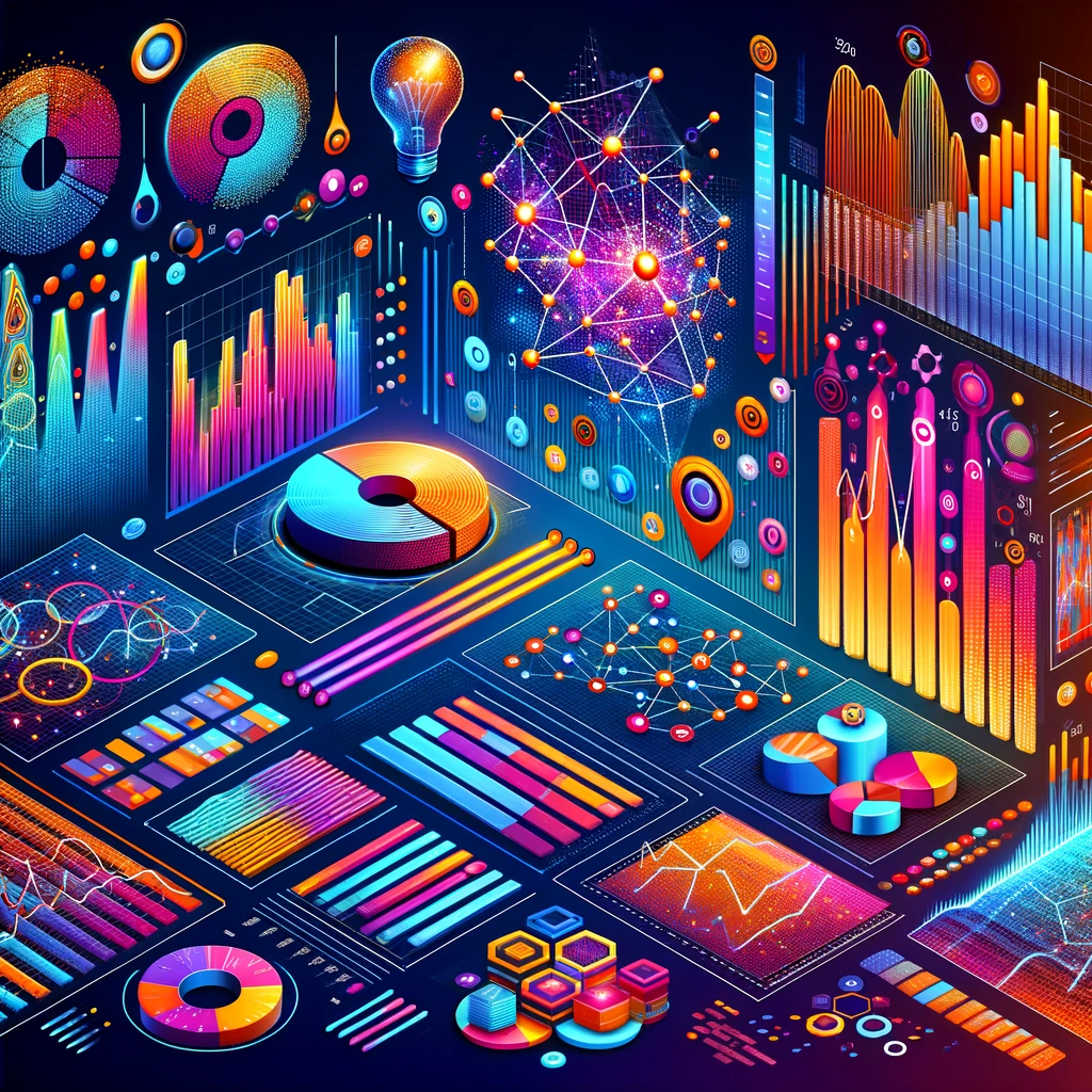
There are a number of different data visualization tools available, each with its own strengths and weaknesses. Here are the top 10 data visualization tools for data scientists in 2023:
- Matplotlib: Matplotlib is a Python library that is widely used for data visualization. It is a powerful tool that can be used to create a wide variety of charts and graphs.
- Seaborn: Seaborn is a Python library that is built on top of Matplotlib. It provides a number of high-level functions for creating statistical graphics.
- Plotly: Plotly is a web-based data visualization tool that is known for its interactive charts and graphs. It is a good choice for data scientists who want to create visualizations that can be shared online.
- Tableau: Tableau is a desktop data visualization tool that is known for its ease of use and its ability to create complex visualizations quickly and easily.
- Power BI: Power BI is a Microsoft product that is known for its integration with Excel and other Microsoft products. It is a good choice for data scientists who work in corporate environments.
- Qlik Sense: Qlik Sense is a data visualization tool that is known for its in-memory analytics capabilities. It is a good choice for data scientists who need to visualize large datasets.
- Domo: Domo is a cloud-based data visualization tool that is known for its ability to connect to a wide variety of data sources. It is a good choice for data scientists who need to visualize data from multiple sources.
- Looker: Looker is a data visualization tool that is known for its business intelligence capabilities. It is a good choice for data scientists who need to create visualizations for business users.
- Sisense: Sisense is a data visualization tool that is known for its embedded analytics capabilities. It is a good choice for data scientists who need to embed visualizations in other applications.
- ThoughtSpot: ThoughtSpot is a data visualization tool that is known for its search-driven analytics capabilities. It is a good choice for data scientists who need to allow users to explore data without having to write code.
Conclusion
These are just a few of the many data visualization tools that are available. The best tool for you will depend on your specific needs and preferences. When choosing a data visualization tool, consider the following factors:
- Ease of use: How easy is it to learn and use the tool?
- Features: What features does the tool offer?
- Integration: Does the tool integrate with other software that you use?
- Cost: How much does the tool cost?
Once you have considered these factors, you can start to narrow down your choices and choose the data visualization tool that is right for you.